Saturday, 26 March 2016
Friday, 25 March 2016
Colour Choices and Tonal Range
To begin with I took my emulation illustration and started to experiment with different colour schemes. I did this to test whether a specific colour scheme would work better for my lyric book or if my original idea of following the Edward Gorey style would suit my work better.. Below is my first colour scheme test which is a black and white / monochromatic test.


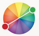


The second test I tried was a complimentary colour scheme. This consisted of red and green hues as shown in the colour chart below.

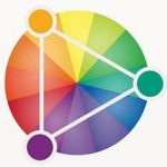
Another colour scheme I tried was an analogous scheme. Shown below is a colour wheel showing the variety of hues I used. I chose purple for this example so that there was a large difference between each colour scheme I chose to experiment with.

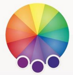
The final colour scheme I experimented with was a set of Triadic colours. These consisted of purple, green and orange hues. Although throughout each colour scheme it came obvious that a variety of colours did not match the style of my illustrations and therefore I will be using a monochromatic and bright red hues to contrast for my final pieces.

Wednesday, 23 March 2016
Type Choices - My Own
For my front cover I decided to make a typeface. I firstly started this process by creating five sketchbook pages full of a variety of fonts. These different types of fonts included hand-written inspired fonts but also display styles. This gave me an idea of what type of font I would be aiming to create for my illustrated lyric book cover. Below are my first five pages of example font.


Once I'd finished my example typefaces and finished experimenting with different styles I went onto creating my own hand-written typeface. To do this I started with ink and a brush and began generally writing out the alphabet. After I'd done this I started to flick ink over my page at random and also spread some of the ink droplets over the top of the letters. This was somewhat of an experiment because I didn't know if it would work or not. 


Surprisingly it did and it worked well, to see the full effect of what my type may be like I placed it a draft I'd previously created. Doing this gave me the ability to properly see the effect of my typeface. I'm happy with the outcome and will be using my own typeface on my final piece.

Tuesday, 22 March 2016
Type Choices - Digital
Below are a selection of digital typefaces which I found and downloaded from DaFont. These were positioned on a Photoshop document where screenshots were taken, allowing for each font to be presented clearly. Beneath you can see the original Photoshop documents of all the types I gathered.


I then arranged a number of other typefaces into a chart, starting with an example of the typeface then a column for both pro's and con's of each font.
Once I'd finished writing the pros and cons, I began to put some digitally downloaded fonts onto a draft I'd made of my work. This in turn helped a great deal, and gave me the ability to eliminate different styles of font which did not match the feel of my product. All of the following screenshots show only the placement of my title, and the drafted sketch I'd done for my final drafting.

This next font is a display type font which somewhat resembles bubbles. Although this is effective I will not be using a font like this due to the fact it doesn't fit with the genre I am aiming for, nor would it be effective if I used it in this situation.

Below are two types of hand-written types of font. This gives the type of effect I'm looking for, for my final piece. The authentic, scratchy type look to the typeface is something which contrasts my drawing style for this piece of work. I've come to the conclusion that I will be using and creating a hand written type for my final piece


Once I'd finished writing the pros and cons, I began to put some digitally downloaded fonts onto a draft I'd made of my work. This in turn helped a great deal, and gave me the ability to eliminate different styles of font which did not match the feel of my product. All of the following screenshots show only the placement of my title, and the drafted sketch I'd done for my final drafting.
The first example of font is a script type font, this gives an elegant feel to my draft and this is not the effect I'm aiming for. Although this font is effective at standing out against my sketch it does not lend itself to the genre in which I'm creating my illustrated book, and therefore I will not be using this fort or a font similar to this for my final piece.
Below are two types of hand-written types of font. This gives the type of effect I'm looking for, for my final piece. The authentic, scratchy type look to the typeface is something which contrasts my drawing style for this piece of work. I've come to the conclusion that I will be using and creating a hand written type for my final piece


Monday, 21 March 2016
Emulation No. 1
This is the emulation I did, this was done in the style of my copy therefore it was completely done in inks and pens. To keep consistency throughout my products I purposely used a quick sketch I'd done for my drafting and developed it into this emulation. This meant I could get an idea of what my final products may look like because they will also be done in this style.
To start with I drew out the line-art and developed it from my draft, once this was completely I started with the ink. This process, like my copy was done with a dip pen. Firstly I stared to go over the outline and then I started to go through my drawings and draw in fur detail on both the hare and the fox. I re-did the fur detail on some parts to make it darker and show fur colour definition even though it's in black and white; this meant the parts of a fox which is primarily dark, so was my drawing.


This is the final emulation. This was developed using the same style of shading and the same processes as John Kenn. This allowed me to use individual lines to shade my drawings.

Sunday, 20 March 2016
Copy - John Kenn

Once the sketching process was complete I began using a dip pen and some black Indian ink to fill in the gaps. Starting with the fence in the bottom of my image I started to sketch and draw the wood texture with the dip pen. This due to the fact I’d only just started was extremely difficult and It took me a few hours to completely figure out how to work the dip pen properly without spilling ink all over my work. Once the fence was half completed I started on the boy which is situated in front of the fence. Working with the different saturations of dark throughout the image, I had to re-do the lines on the boy’s hair to make it more defined and stand out against the fence background.

Once I’d finished the fence I started on the ‘ghouls’ or ‘monsters’ floating behind the fence looking at the boy. These was generally harder to illustrate than the boy and the fence was due to their intricate nature.

After the ‘ghouls’ were done I moved onto the background. Although this caused some trouble, I ended up accidentally dropping in over the existing work whilst trying to do the gradient background

Once all the inking was done, I scanned the final piece into my laptop. Moving the picture into Photoshop, I started to changed the levels of the photo and then add a orange filter over the top of the image. This initially gave my copy the feel that it had been created on a post-it-note, like the original had.

This is my final piece next to the original. The original is on the left and my copy is on the right.


Friday, 11 March 2016
Tuesday, 8 March 2016
Cyanotype Experiment Advancement
As an experiment I decided to create a cyanotype. I had previous created a cyanotype as my first experiment, and although this worked well I wanted to create a second one with more elements added into the design of my original Photoshop document. Below you can see the update version of my Photoshop document, in the first attempt I did not add a background image to my other images, but in this version I did, I aimed for this to give a more 'twisted' and 'creepy' feel to my work.

I started by printing out my Photoshop document and taking it to be printed onto a special type of paper called acetate. This removed all colour apart from the black sections of my image. After I'd printed this version onto acetate, I then placed this piece of material above a painted piece of paper and placed it under a light box for over an hour. This printed the design onto the paper, although it was inverted. I then ran the piece of paper under cold water once it was complete and allowed it to dry.


This was the outcome of my experiment advancements. As you can see the background imagery suits the style of the images much more than the previous cyanotype I created.

Monday, 7 March 2016
Cyanotype Experiment.
As an experiment I decided to create a cyanotype. This was my first attempt creating an cyanotype so I decided to add subject matter photos onto a Photoshop document and then see how it would turn out.

I started by printing out my Photoshop document and taking it to be printed onto a special type of paper called acetate. This removed all colour apart from the black sections of my image. After I'd printed this version onto acetate, I then placed this piece of material above a painted piece of paper and placed it under a light box for over an hour. This printed the design onto the paper, although it was inverted. I then ran the piece of paper under cold water once it was complete and allowed it to dry.
This was final outcome.

Sunday, 6 March 2016
Further Drafting / Refinement
Below are the final drafts for my lyric book. These have had the final refinements before it comes to making my final thing. These refinements included firstly making my sketches more detailed, this allowed me to experiment more with the sizes of my drawings.
Back and Front Cover


First DPS


Second DPS


Friday, 4 March 2016
Developed Drafting - Double Page Spread
Below are my developing drafts for my lyric book. These have had the more detail refinements than my scamps. These designs have been narrowed down into two design, and these designs are the ones which have been developed more. From these design I will be choosing a final design and re-drawing it in more detail, but also making some changes to match the stylized design I'm aiming for.
Count Bodies Like Sheep


Ten Thousand Fists


Youth Of The Nation


Dance With The Devil


Subscribe to:
Posts (Atom)