

The second test I tried was a complimentary colour scheme. This consisted of red and green hues as shown in the colour chart below.


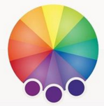
Another colour scheme I tried was an analogous scheme. Shown below is a colour wheel showing the variety of hues I used. I chose purple for this example so that there was a large difference between each colour scheme I chose to experiment with.

The final colour scheme I experimented with was a set of Triadic colours. These consisted of purple, green and orange hues. Although throughout each colour scheme it came obvious that a variety of colours did not match the style of my illustrations and therefore I will be using a monochromatic and bright red hues to contrast for my final pieces.


No comments:
Post a Comment